Glossy vs Matte Book Covers Plus Some Big News!
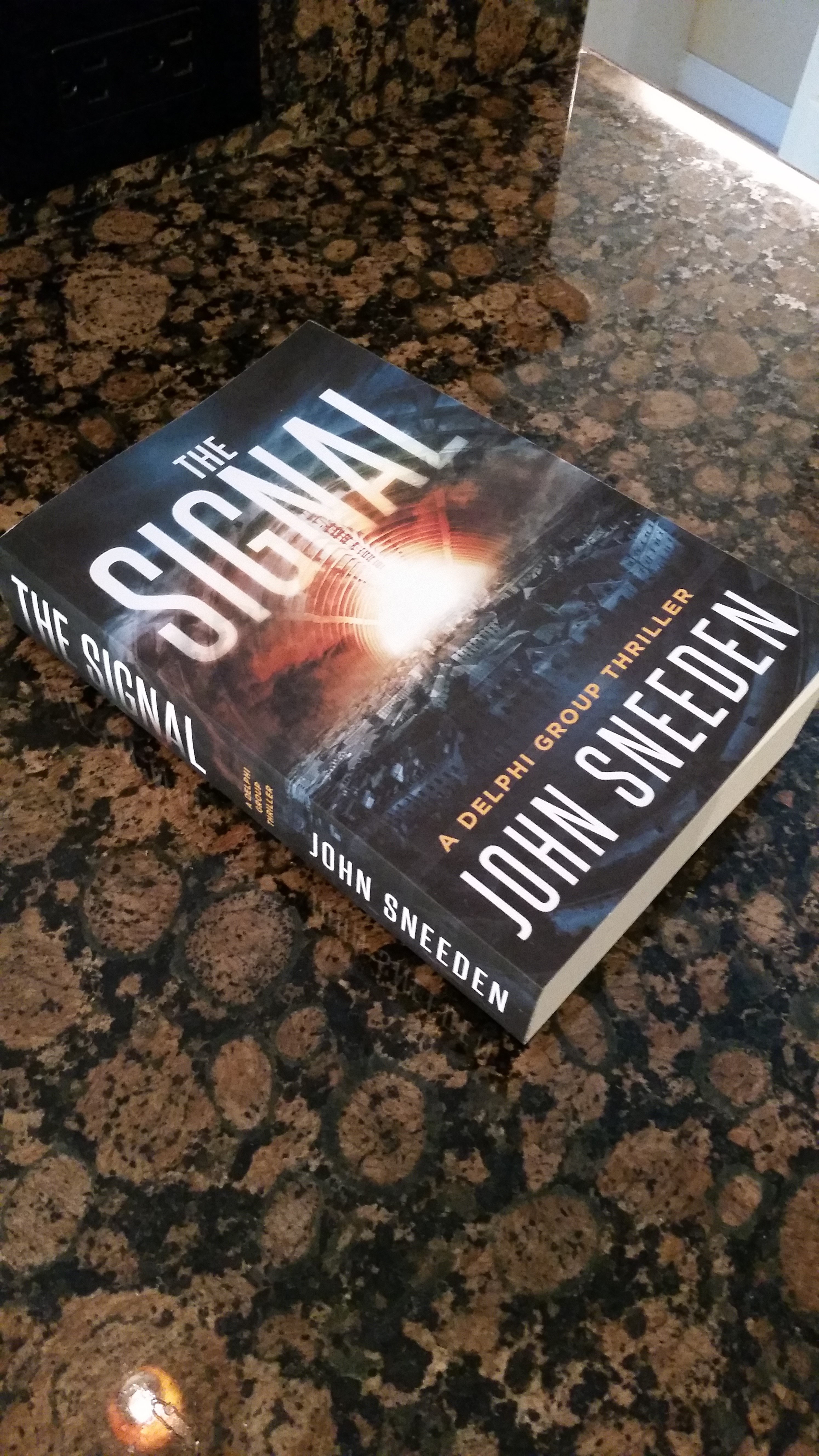
For those who have purchased the print version of The Signal, how does it look and feel in your hands? What about the pages inside? Are they easy on your eyes?
When I began writing in the spring of 2013, I had no idea that I’d be making decisions about cover texture and page color. Over the years I’ve read hundreds of books and have therefore encountered virtually every cover and page type known to man. But for some reason it never occurred to me that I’d have to put all of that together myself.
As I began my research, I noticed that authors held a wide variety of opinions regarding cover texture, some conflicting. For example, the majority said that glossy covers tended to curl more quickly than matte covers. However, there were some, albeit a minority, who insisted that matte covers curl just as badly. In my opinion, glossy covers do curl a bit more, although the paper quality and the way they’re put together probably play a role in the degree of curling, which means it’s not just texture alone. In fact, I’m reading a book with a glossy cover right now, and that cover lays down flat as a pancake. It’s just a guess, but I’d say that’s probably because quality paper was used in the production process.
There were also a wide variety of opinions about which covers are best at enhancing color. I believe that in general glossy colors tend to show bright colors better, but that’s just my opinion. Unfortunately there are no black and white answers. Trial and error is the key.
In the end, I chose a matte cover, even though I personally prefer the look of glossy. The reason is because, rightly or wrongly, the perception is that matte covers have a more professional, quality look. And as an indie writer I want to portray quality in everything I do. So back to my question at the beginning of the article—how does The Signal look and feel in your hands? Was my decision a good one?
Once I chose my cover texture, then the choice of page color was easy. CreateSpace gives you two options—white or yellow—and I quickly realized that the more traditional yellow would go well with the traditional matte cover. Conversely, if I had chosen a glossy cover I would likely have chosen white pages to go with it.
And now, before I leave, I have some exciting news to pass along. Around this time next week, I’m going to announce the working title of my next novel, the sequel to The Signal. So stay tuned and please pass the word!


I can’t wait to hear the new name! How wonderful!!
I enjoyed the quality of the paper of the ‘signal’. The pages were easy to turn and i was able to read it easily whether on a plane, sitting at a table, or laying in bed. I did notice the quality as I read it. Re; the glossy v matte. I didn’t realize it, but when i look back, i am glad it is matte. Glossy would have looked and felt less professional’ in my opinion, and would have been harder to read while traveling. I am thankful that it didn’t have a ‘book cover’ because i normally remove them… Read more »
John,
Great post. I really enjoy the matte cover. Also, not so white pages. The curling could also be made worse by the reader, I for one totally abuse my books, which brings me to my next statement: I also like a good sturdy book! Very excited about the next sneak peek revelation.
BRAVO!